Eye Tracking
We used AI to simulate human eye movement and measure exactly how attention-grabbing different sections of the site appeared at first glance. The below results are from their ticket section. The map shows an evenly distributed amount of interest. If we think of user time and attention the same as money, we understand that our audience only has so much that they can spread around.
In the original design, the key conversion drivers like CTA and pricing were completely lost. This means that users have to put in a lot of effort to actually find what they're looking for.
Our recommendation (in red) shows a more prioritized offer structure, with the featured ticket offer more prominently displayed as the default option. With these results, we could easily determine if the elements receiving the most attention were in line with our usability goals and information priorities.
We improved our clarity score, because cleaner and clearer designs reduce cognitive load and corresponded with higher conversion rates.
Features
A few user scenarios that made it to prototyping and production stages.
- Interactive timelines
- Self-guided audio tour
- Virtual field trips
- Quizes & lesson plans
- Social media chatbot
- Dynamic events calendar
- Fun with their 404 page
- Scrolling visual itinerary
Rebranding
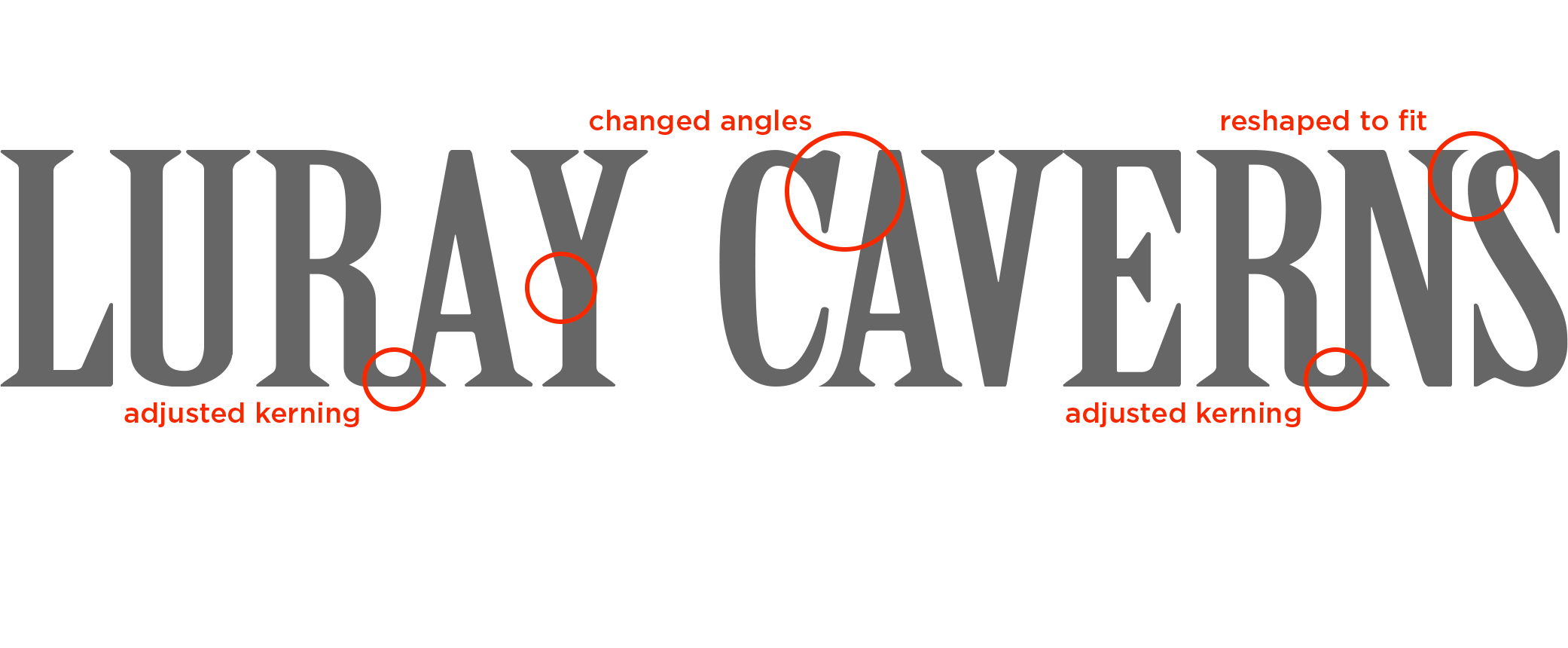
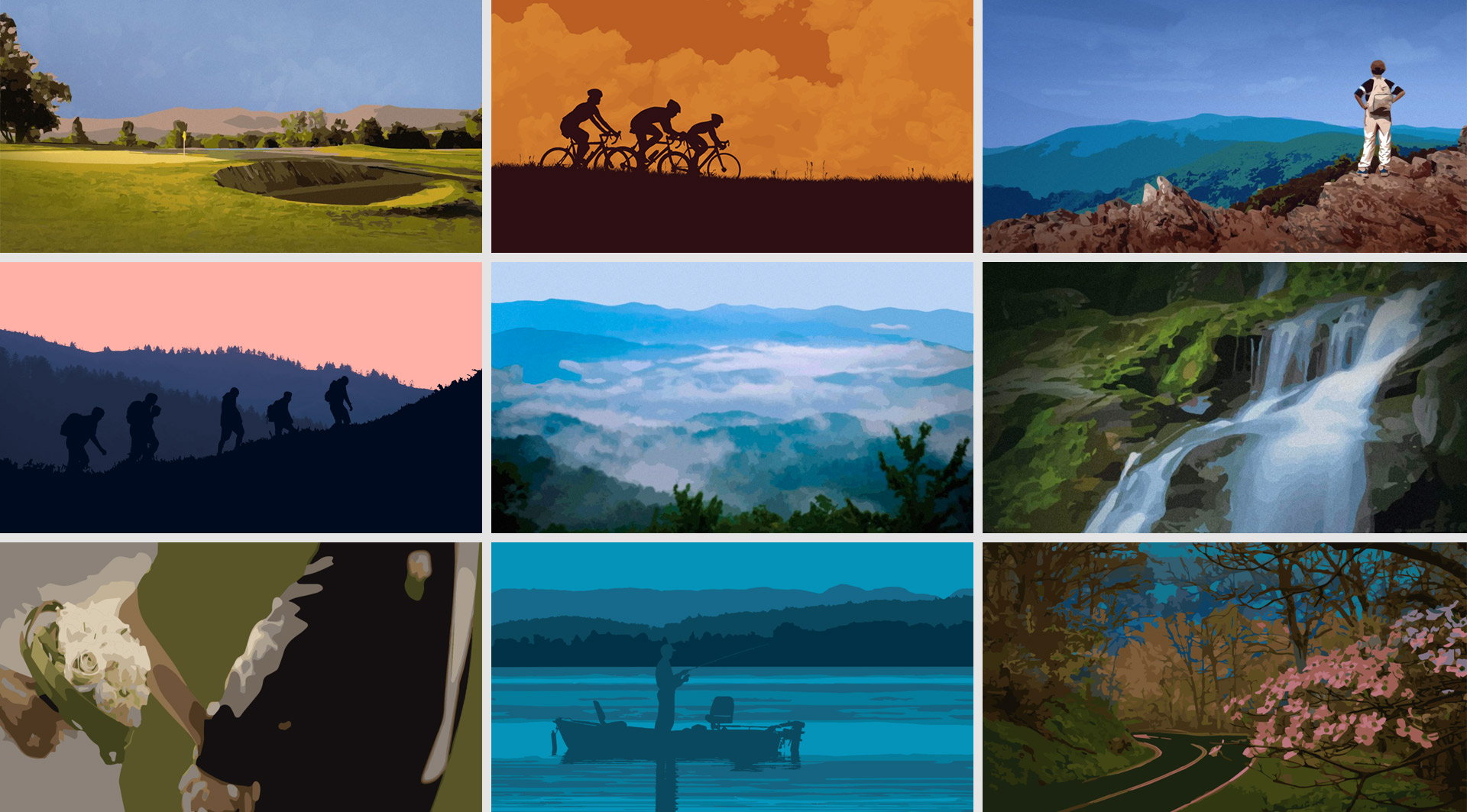
Stylized artwork drew inspiration from vintage National Park Service posters. This provided us with a unified visual language to use across the site, while also keeping file sizes and page load times down. Slight modifications to the logo improved legibility on small screens.

Results
Our mobile site saw a 43% increase in page speed score. There was a 90% increase in overall web sessions after 3 months, many of whom were return visitors. Despite a decline in 2018 ticket sales, the online ticket sales went up, along with newsletter signups and social media follows. Our redesigned newsletter nearly doubled previous open and click through rates.
